Dymaxion Projection Animation
UPDATE!
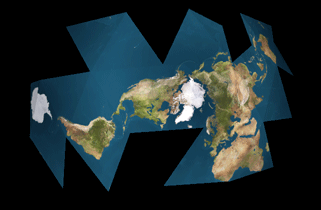 After lying untouched for years -- I haven't even looked at this in at least
three -- there was such an interest surge in this animation that I revisited
it for a new improved rendering. The miracle: Even seven years later, my C
code is still readable, my POV files still render properly, and my animation
still works. POV has greatly improved its interface and there are a wealth
of new Earth images to use. I found the Virtual Terrain Project's page to be extremely
helpful. I finally decided to use James Hasting-Trew's map
which is not, as he writes, ``accurate or true in the strict
photographic sense,'' but is close enough for my rendering, which is
also not true in any sense. Most importantly, though, James' map is
really, really pretty.
The result is much improved in almost every way. The new files are all in this directory.
There you'll find a POV file for each individual frame, 000 to 077 inclusive; a PNG file for each frame;
a
ZIPfile of all the POV files; a
ZIPfile of all the resulting PNGs at 800x600; a 1.1 megabyte Flash animation; a
4.3 megabyte 800x600 GIF animation for the brave of heart; a 433k MPEG;
the
new C code for generating the POV files; and the Earth map used for my renderings, which is a reduced copy of James Hasting-Trew's 10k map, not to be confused with his lower-resolution versions. Don't ask me why I made my own.
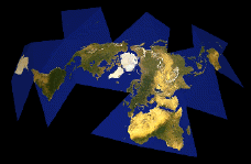 My animation of an unfolding Dymaxion Map is available as a
1.4 meg ZIPped 640x480 QuickTime
or as a 40k ZIPped 320x240 QuickTime
or as a 400k 160x120 Java animation.
This is an animation illustrating Buckminster Fuller's Dymaxion Map Projection
of Earth. While this animation is not mathematically accurate, I
think it's a good illustration of the concept.
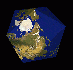
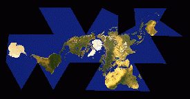 Basically, Fuller started with the data for the spherical Earth surface. He
projected the data from the sphere onto an icosahedron -- the twenty-
sided Platonic solid -- and then unfolded that icosahedron out flat.
The advantages of this method are many: for one thing, it's possible to align
the surface data with the icosahedron in such a way that, when
unfolded, no landmass is cut into, which allows us to see the Earth's
landmasses as one continent (this is where my illustration falls short;
note that the landmass is cut into in a couple of spots); also,
this method results in nearly no distortion of either size or shape
of the landmasses, unlike most other projections (the familiar
classroom Mercator map or the Peters projection, for example).
Anyway, this illustration was made using a
C program to output Persistence of
Vision Raytracer files, which were then raytraced on a DEC Alpha
running OSF/1. Each of the 78 frames took about four minutes at
640x480 antialiased. The resulting Targa files were then nailed
together into a QuickTime movie using movieconvert on an SGI Indy.
The mapping was done in POV by spherically mapping what looks like a
GeoSphere graphic of the Earth around the sphere or icosahedron.
That's where the mathematical inaccuracy comes in.
Both animations are hereby released to the public domain.
Thanks to the following information sources:
And, of course, thanks to the works of Bucky Fuller.
 After lying untouched for years -- I haven't even looked at this in at least
three -- there was such an interest surge in this animation that I revisited
it for a new improved rendering. The miracle: Even seven years later, my C
code is still readable, my POV files still render properly, and my animation
still works. POV has greatly improved its interface and there are a wealth
of new Earth images to use. I found the Virtual Terrain Project's page to be extremely
helpful. I finally decided to use James Hasting-Trew's map
which is not, as he writes, ``accurate or true in the strict
photographic sense,'' but is close enough for my rendering, which is
also not true in any sense. Most importantly, though, James' map is
really, really pretty.
 My animation of an unfolding Dymaxion Map is available as a
1.4 meg ZIPped 640x480 QuickTime
or as a 40k ZIPped 320x240 QuickTime
or as a 400k 160x120 Java animation.

 Basically, Fuller started with the data for the spherical Earth surface. He
projected the data from the sphere onto an icosahedron -- the twenty-
sided Platonic solid -- and then unfolded that icosahedron out flat.